Dinair Airbrush Makeup: Beautifying a Check Out Flow With Elegant UX
The Challenge:
Dinair Airbrush Makeup has been a leader in airbrush makeup since the 80s and is a woman-owned small business. But in today’s digital landscape, simply offering exceptional products isn’t enough. Dinair needed to bridge the gap between its product quality and its online presence. That’s where I came in.
The Solution:
As the in-house art director, I saw the potential to elevate Dinair’s online presence and unlock greater business success. Collaborating closely with the developer and marketing teams, we formed a united front to transform Dinair’s digital experience. Achieving a 20% increase in sales and digital engagement within 2 months of launch.
My Contributions:
-
E-commerce and UX Strategy
-
User Research
-
Workshop Hosting and Leadership
-
Wireframing
-
Prototyping
-
Iterative UI Design
-
Art Direction
The Team:
-
UX Lead/Art Director (That’s me!)
-
4 visual designers
-
1 Marketing manager
-
3 Marketing associates
-
1 Lead developer
-
3 developers
-
2 Stakeholders
Timeline:
2 months, from start to launch
*To comply with my non-disclosure agreement I have omitted and obfuscated confidential information in this case study. All information in this case study is my own and does not necessarily reflect the views of Dinair Airbrush Makeup.
Project Summary
What Was Delivered and How
The Goals
- Increase online sales.
- Create a mobile-first and responsive web user experience.
- Simplify the user checkout flow.
- Elevate the look and feel of the overall brand and visual design.
The Challenges
- Confusing and complicated website navigation and info architecture.
- No design systems or style guides.
- Outdated visual design/branding.
- No budget for photo shoots or filming.
The Results
- Increased website sales 20%.
- Increased clicks per view and overall online/digital engagement within 2 months of initial launch.
- Mentored my team of designers by encouraging design thinking throughout the project.
1) Discover: Understanding the Problem
Exploring Dinair’s Current Website and User Flows
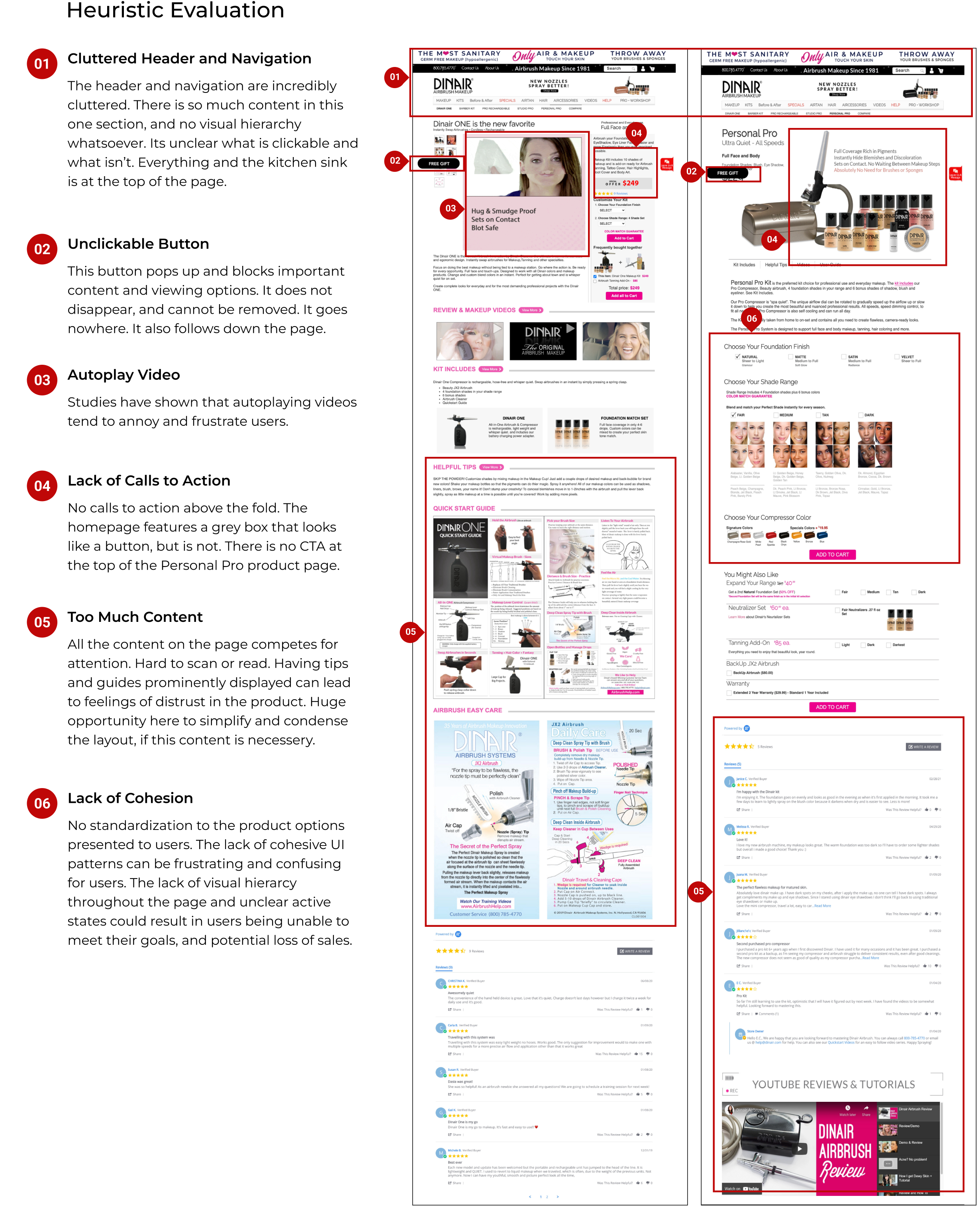
All great UX design is built on a solid foundation of user research. Before crafting the perfect questions for our research, I knew we needed a clear picture of Dinair’s current online presence. So, I conducted a heuristic evaluation of the website, focusing on three key areas:
- The Homepage: Where everyone’s first impression begins.
- The Product Page: Showcasing products and our point of sale.
- The Checkout Flow: Charting each step of the user checkout journey.
Heuristic Evaluation: Where We Started
My heuristic expedition revealed an untapped potential for enhancement.
- While the website boasted great products, it wasn’t optimized for mobile – where most online sales happen.
- I noticed many sections felt crowded, each part was vying for attention and jam-packed with content.
- Consistency, too, was lacking, with layouts and fonts taking an eclectic approach across the site.
- Many accessibility roadblocks needed smoothing out to ensure everyone could properly use the website.
Each finding presented a golden opportunity to craft a user experience that’s as smooth as the airbrush makeup itself. By streamlining for mobile, embracing minimalism, and creating a harmonious flow, we could create a website that drives sales and boosts brand credibility. Removing the accessibility barriers would ensure everyone could enjoy the elevated Dinair website experience.
What I discovered was that the website had many opportunities for improvement.
Focus Group Revelations
Armed with heuristic insights, the team dove deeper with a nine-person focus group made up of customers visiting the studio for one of Dina’s airbrush workshops. These workshop attendees, makeup artists aged 19-55, put both the desktop and mobile webs through their paces.
We also cast a wider net with a Google Survey, gathering quantitative data from existing users.
Many common pain points emerged. From mobile snags to cluttered landscapes, it was clear users yearned for an experience that mirrored the quality the of airbrush products themselves.
Key User Research Insights
“It looks like a bad Barbie fansite from the 90s. I would not buy anything from this website. I dont trust it at all.”
“I literally can’t find anything on this site at all. Where even is the navigation menu?”
“Oh my god…I hate this menu so much! Why is it so different for each part? Its the worst!”
“It looks like tacky marketing from Las Vegas. Like the kind you’d see at a boxing match.”
Total Users Tested
%
of users confused
%
unable to finish tasks
Cups of Coffee
Sharpening Our Focus: Affinity Diagramming
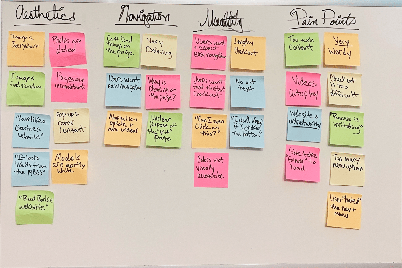
With mountains of user insights from interviews and focus groups, I lead my team on an affinity diagramming exercise. We huddled around a whiteboard, armed with sticky notes and sharp minds, to untangle the user experience. Through brainstorming and affinity diagramming, we grouped feedback into four key areas:
- Aesthetics: Users yearned for a website that looked modern and sleek, that better reflected the quality of the airbrush makeup itself.
- Navigation: Clutter and inconsistency were making finding products and purchasing them a maze.
- Usability: Frustrating navigation and technical hiccups were sabotaging the user journey.
- Pain Points: From mobile snags to overwhelming options, users pinpointed specific hurdles they had to overcome.
A Peek into the Cosmetics Landscape: Competitor Analysis
Next, we needed a clear view of the retail cosmetics landscape. To sharpen our strategy, we delved into the competitive cosmetics landscape. My team and I analyzed two key groups:
- Airbrush Competitors: We studied two other airbrush makeup brands, understanding their strengths and weaknesses to identify strategic opportunities for Dinair to stand out.
- Traditional Makeup Brands: We explored two traditional makeup giants to see how they engage and retain customers, gleaning valuable insights for Dinair’s own loyal fanbase.
This market research wasn’t just about checking boxes; it was about fueling smart, strategic decisions that would propel Dinair’s brand reach, sales, and customer retention. Providing us with a basis for our data-driven action strategies moving forward.
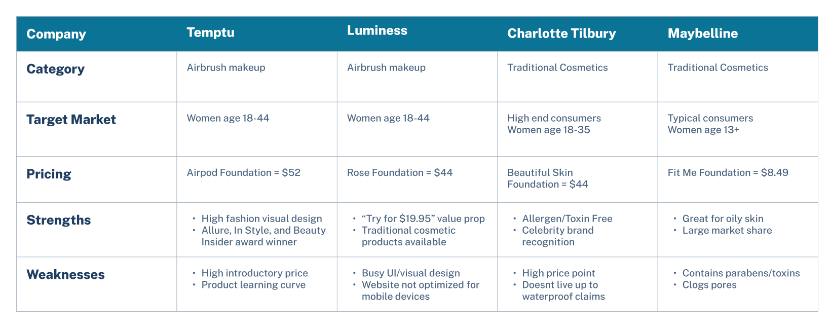

We discovered that users valued chic visual design and a simple e-commerce experience.
Synthesizing the Data for Stakeholders
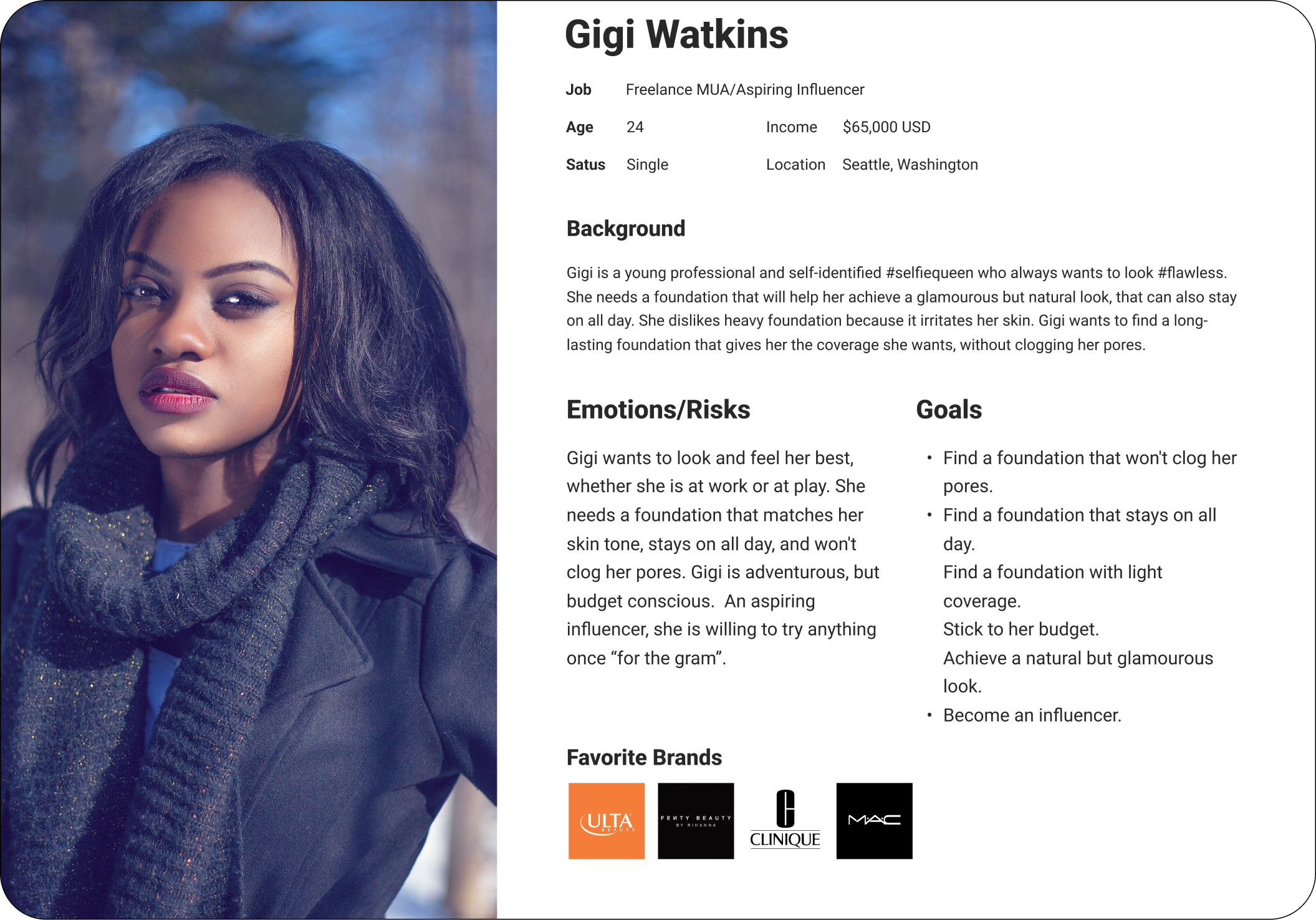
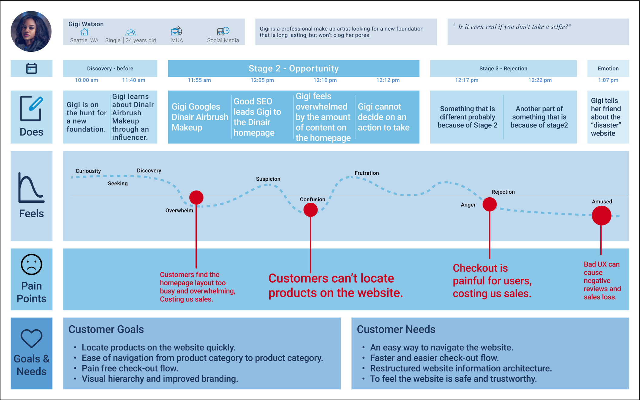
With our research completed, I created a user persona and customer journey map based on the data we gathered. I wanted to make sure I presented a crystal clear picture of our customers, their goals, and their pain points to stakeholders and the marketing team from the get go.
Without further adeiu, meet Gigi. A professional make-up artist and aspiring influencer.
Let’s Shop with Gigi: User Journey Mapping
To make our customers’ online experiences really resonate with stakeholders and the marketing team, I put together a user journey map. This visual guide revealed the key pain points our users faced, and highlighted when and where Dinair was losing online sales.
2) Strategize: Turning Insights into Action
Narrowing Down the Scope of Work
To better partner with the developer team from the start, we held a brainstorming workshop with them and presented our user research insights. Based on all our user data, we discovered several key pain points:
- 98% of users felt that the website was complicated and confusing.
- 80% of users were frustrated the checkout user flow was arduous.
- 8 of 9 users in our focus group found it was easy to feel lost on the website.
- Users were overwhelmed by the lack of information hierarchy throughout the website.
Our research illuminated many opportunities to organize the website and simplify the check-out flow.
Untangling the Labyrinth: Crafting a User-Friendly Navigation
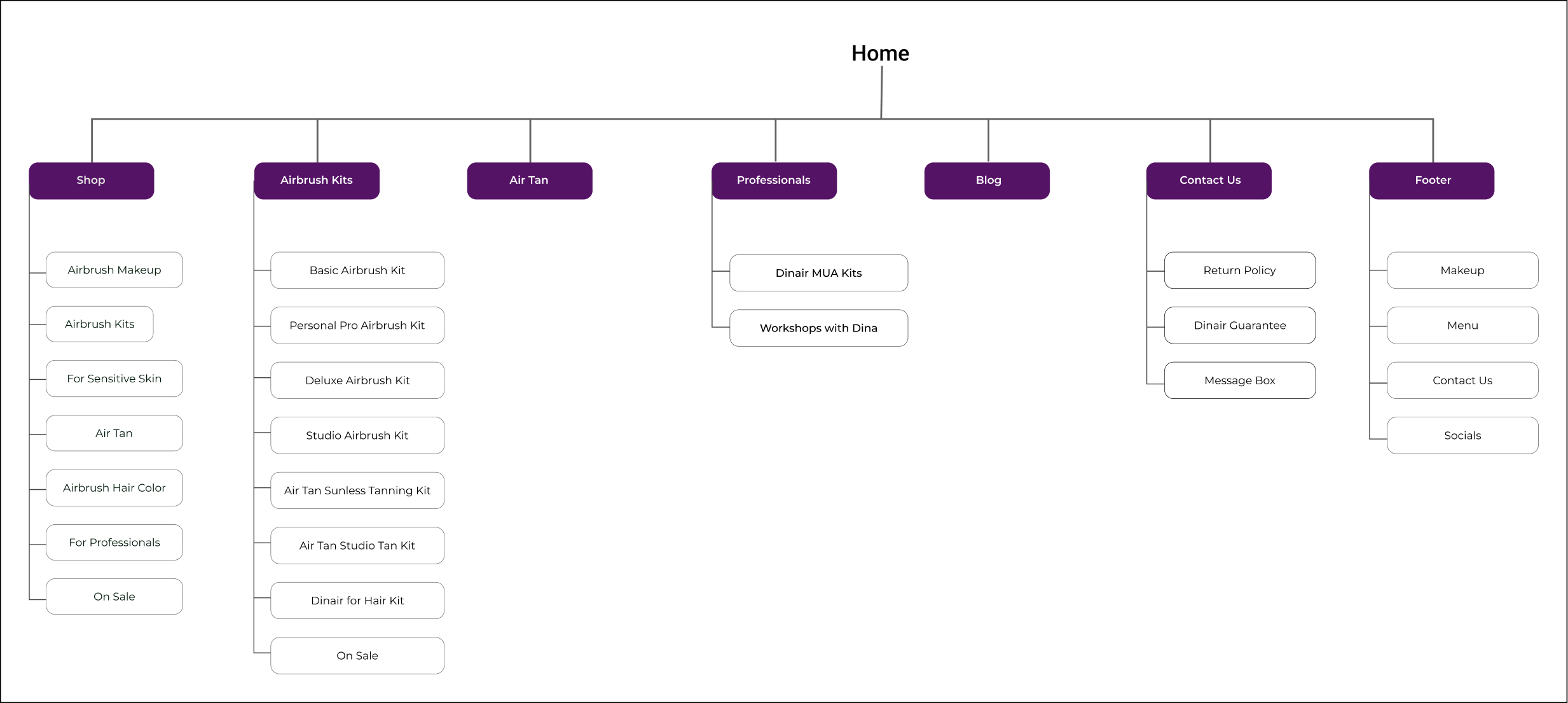
To untangle the navigation web, I led a card sorting exercise with my team to better understand the many user pathways of the current website.
From there, I was able to reorganize all the information architecture, crafting a new sitemap that’s clear and concise. Creating a simpler and more organized navigation experience for our users.
To increase sales, I put special focus on highlighting our various airbrush kits. Which consistently rank as some of Dinair’s best-selling products across all categories.
Cutting Through Clutter: Mapping the “Buy Now” User Flow
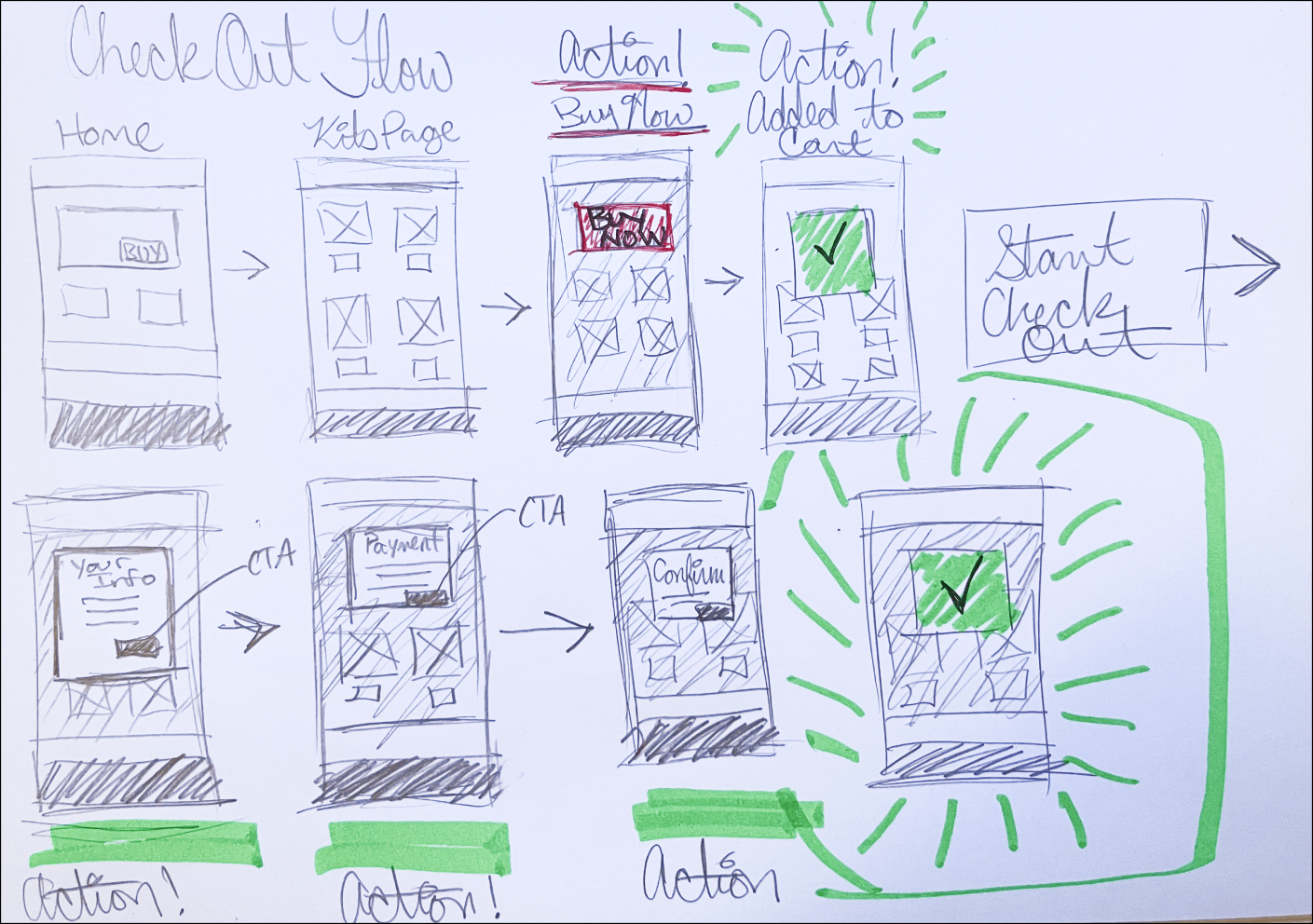
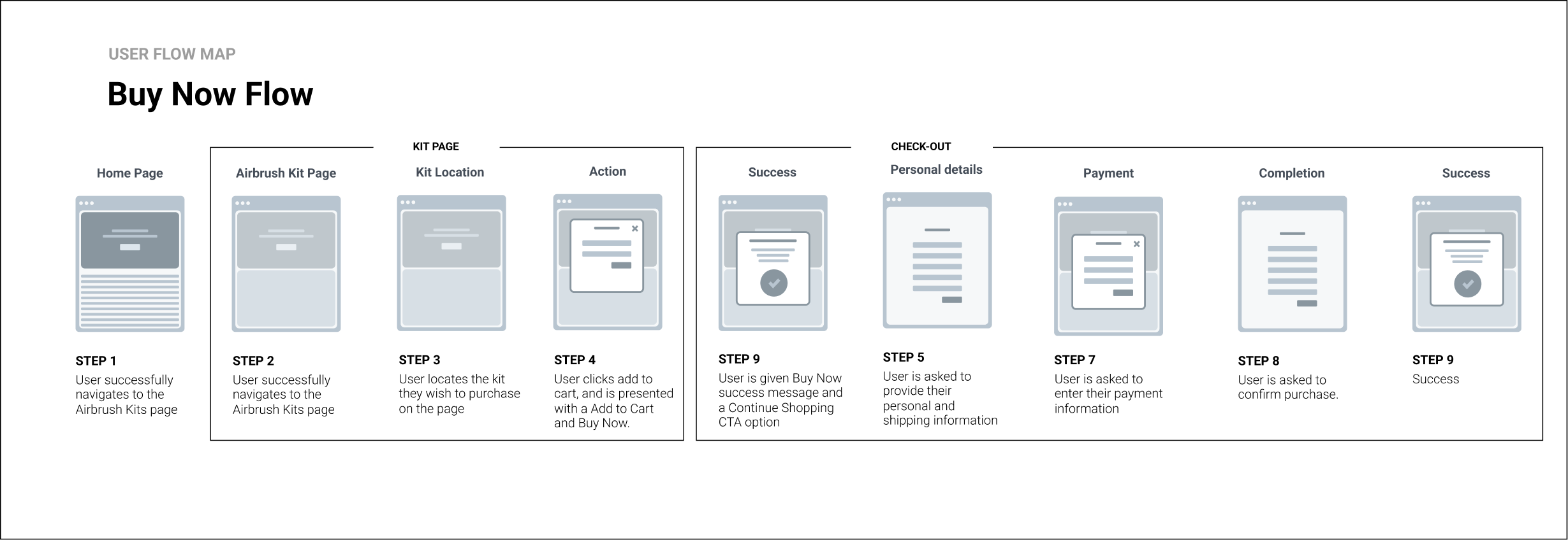
Before I could begin wireframing, I had to draw out the new Buy Now flow.
Research unveiled a major user pain point: the absence of a “Buy Now” option on all products. Beauty enthusiasts craved a quick and effortless way to snag their airbrush essentials, bypassing unnecessary clicks and content.
My goal then became to alleviate user frustration by transforming the checkout flow from a frustrating maze into a smooth, satisfying sprint. I focused on making sure the checkout process was intuitive, with as few steps as possible. By prioritizing user needs and streamlining the checkout process, we paved the way for a happier, more engaged Dinair community.
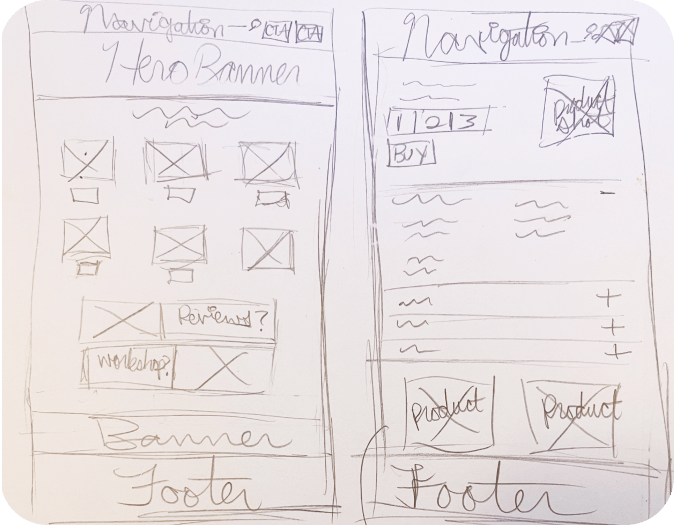
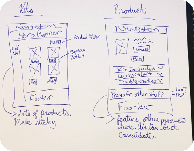
Thinking Through My Pencil: Iterative Sketching
With a plan in place, I began sketching out UI ideas, fresh off the buzz of camaraderie from all our brainstorming and workshops during the research phase. Sketching allows me to explore and work out many ideas and layouts quickly. Keeping me light on my feet.
Designing Mobile First: Low-Fidelity Wireframes
With rough sketches in hand, I began wireframing the new user interfaces. Working out solutions in the low-fidelity wireframe allowed me to stay agile, and explore lots of different options quickly.
I designed mobile first because I wanted to focus on setting up the responsive design patterns for the website. In today’s digital age, where smart devices rule the roost, mobile is where the majority of online sales happen. So making sure we got the mobile experience right from the start was crucial.
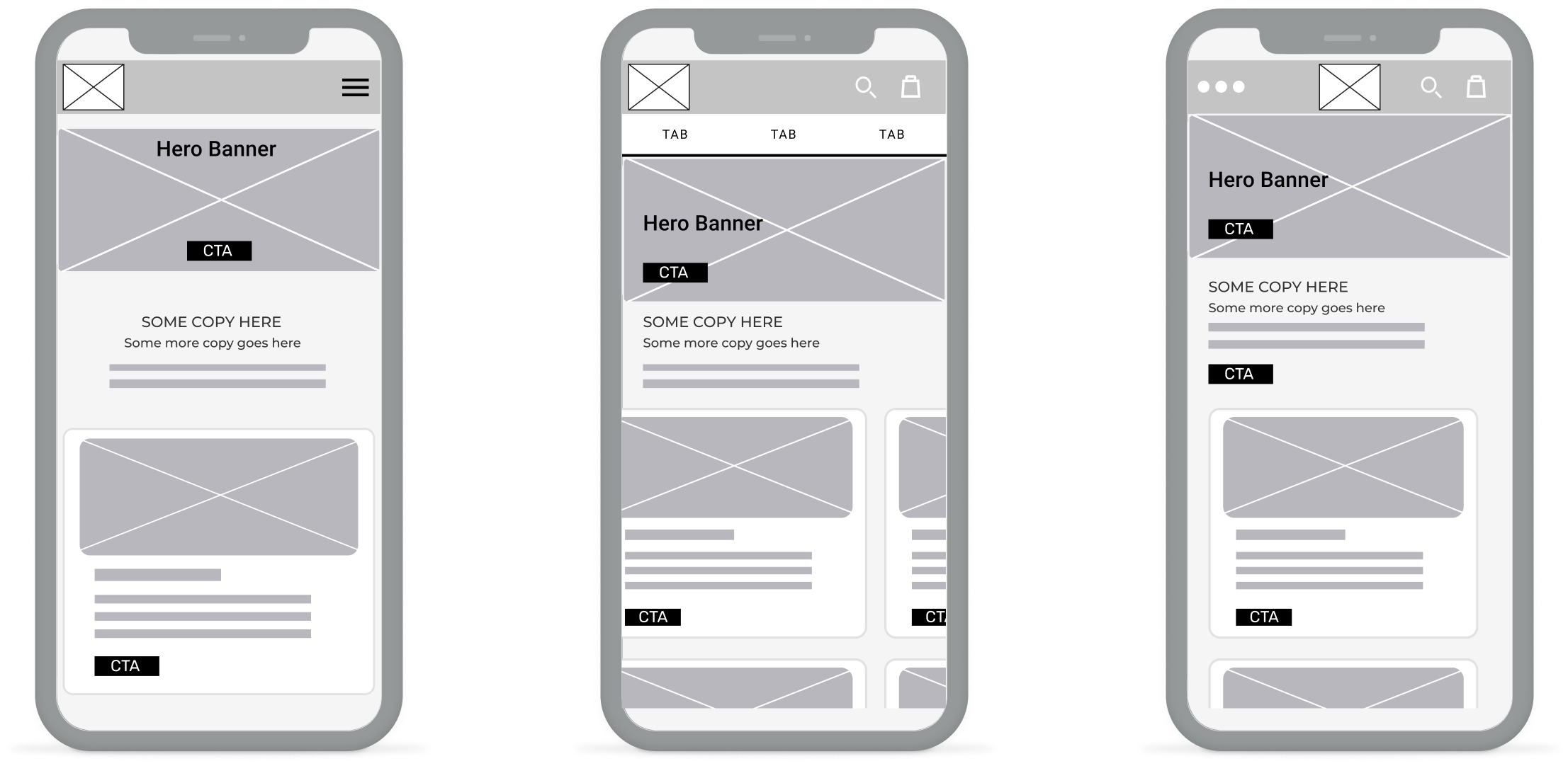
In today’s digital world, the majority of online sales happen on mobile devices.
To ensure everyone was in sync, I whipped up a user flow wireframe for the developer team. Think of it as a roadmap highlighting crucial user interactions, starting with the Kit Page, and each step in the checkout flow.
Every click, tap, and input was meticulously designed for simplicity and intuitiveness, echoing our research findings – speedy checkouts make our customers happy.
Crafting a Seamless Checkout: Low-Fidelity User Testing
With low-fidelity wireframing complete, it was time to dive back into user testing. My team enlisted 6 makeup artists, straight from Dina’s in-studio workshop. Their mission? To navigate the new Buy Now flow, snag their airbrushed dream kit, and share their thoughts and feels on the revamped homepage and UI.
We watched, we listened, we learned. Every tap, click, and raised eyebrow revealed invaluable insights, guiding us to further refine the user experience.

Users Liked
- The stacked card UI layout best for the mobile user interface.
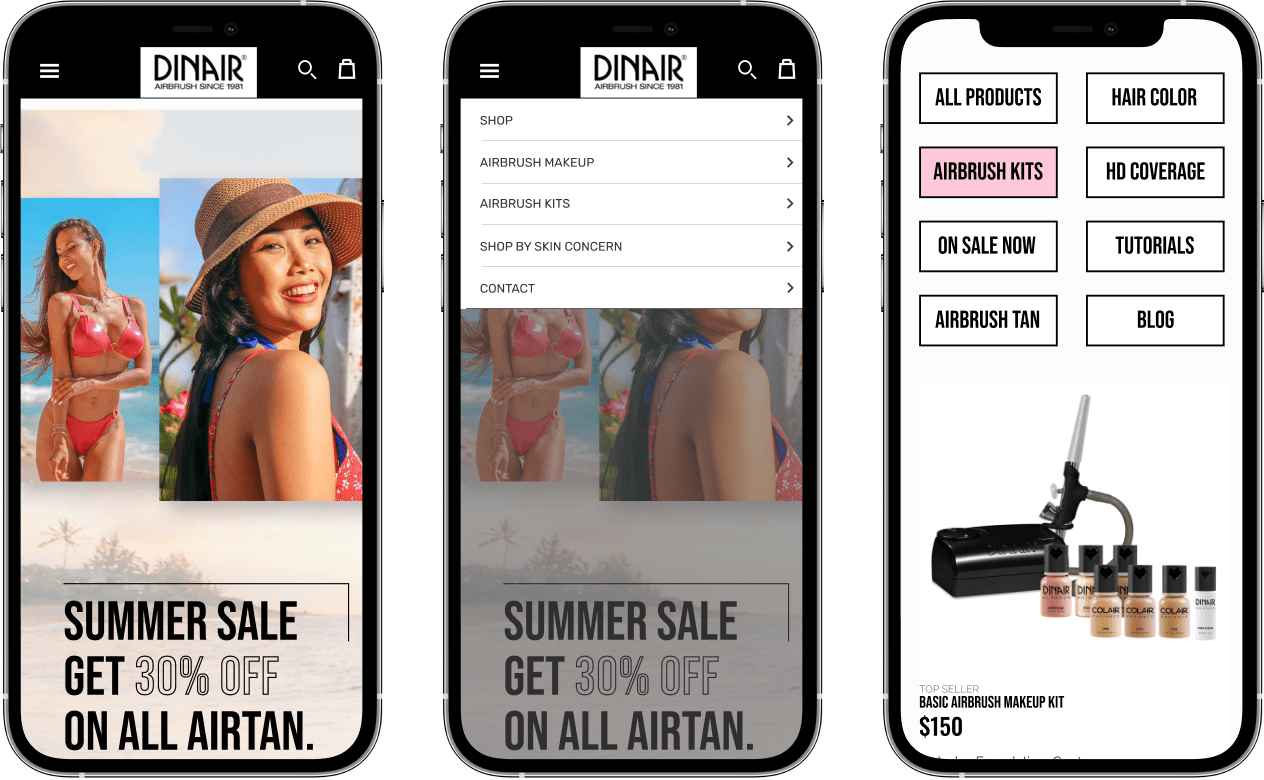
- The logo and mobile navigation menu on the left.
- Users preferred the meatball menu to the hamburger menu option.
- The simple and intuitive drop-down navigation both mobile and desktop.
Users Felt
- Felt confident about completing each of their task.
- Felt each step in the checkout flow was simple and easily understood.
- Users commented the horizontal sliding cards were “ very annoying”.
Users Wished
- For fewer, more condensed options in the navigation menu.
- CTA buttons were not so close together on certain iterations.
- That the drop down navigation menu was “thinner” on the desktop site.
3) Design: Iterating Our Way to Success
Restyling the Brand with a Little Help from Beyoncé
User feedback was loud and clear: the website felt “untrustworthy” and “tacky.” So, it was time for a visual makeover.
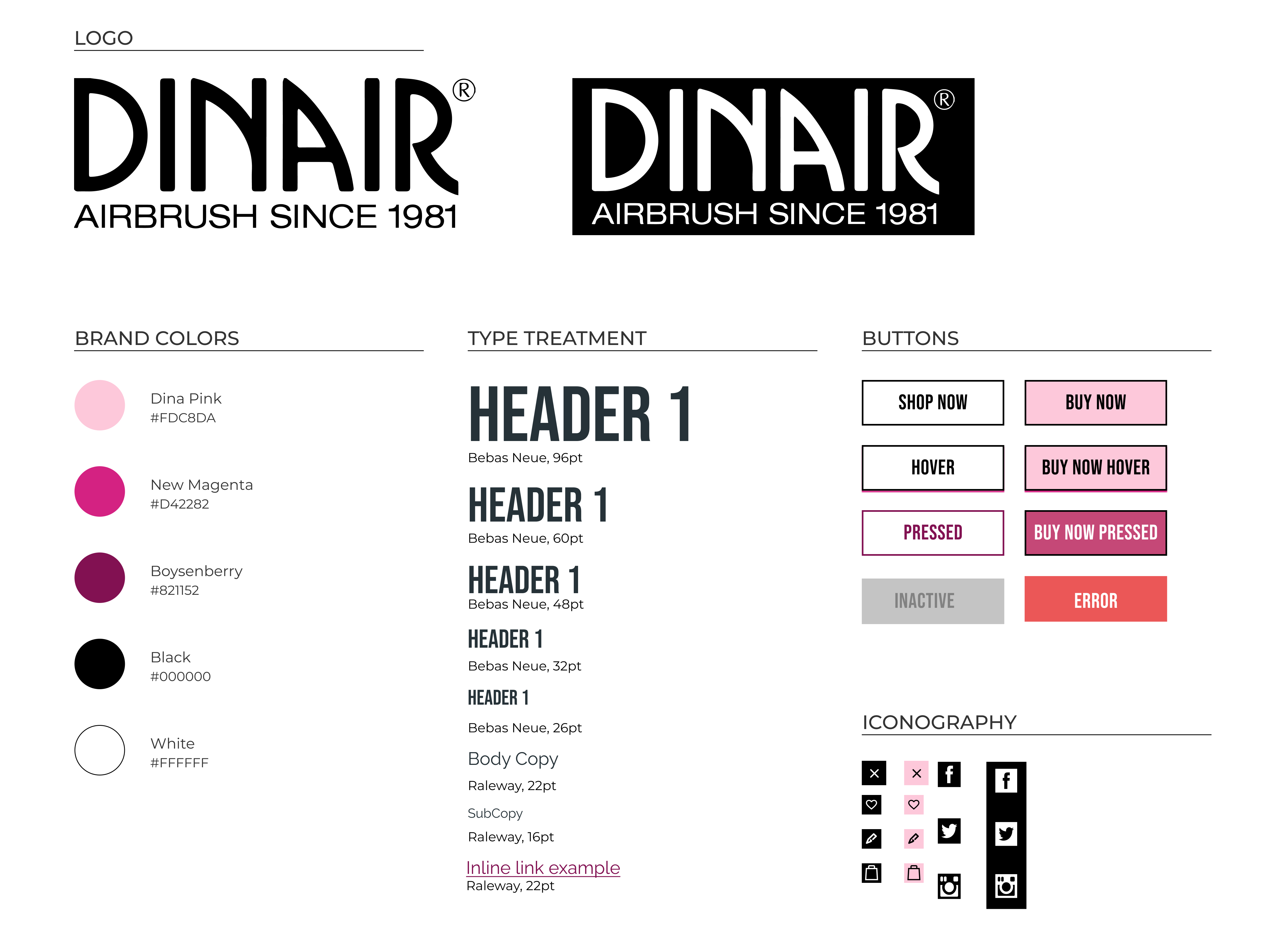
Stakeholders asked that the logo was to remain the same and that the Dina Pink branded color needed to stay. However, they were open to exploring new directions for the look and feel of the website. This gave us lots of room to explore.
I ran some of my initial ideas past my team, brainstorming ways to elevate Dinair’s digital canvas. Chic icons, playful pops of color.
But the biggest transformation came from a bold font choice: Bebas Neue. A font incredibly similar to Beyoncé’s “Lemonade” album font. Bebas Neue brought an air of sophistication and elegance, exactly what we were looking for!
In the next pitch meeting, I found myself saying, “If it’s good enough for Queen Bey, it’s good enough for us.” Thankfully, everyone agreed. Bebas Neue’s sleek lines and modern look felt like the perfect fit, instantly elevating the brand’s online presence.
Beauty In All Shades: Centering A More Inclusive Design
One powerful user comment impacted all of us on the design team: “The models are mostly white.” It wasn’t just feedback; it was a call to action. We knew Dinair, with its extensive shade range and Color Match Guarantee, deserved a website that centered and celebrated diversity.
More than just addressing a pain point, centering inclusivity in our rebrand presented a golden opportunity to:
- Highlight Dinair’s Color Match Guarantee: By featuring diverse models, we could visually demonstrate how everyone can find their perfect color match at Dinair. Making this a more prominent product feature and value proposition.
- Boost online sales: A Google study found that 64% of consumers favor buying from brands that embrace diversity, and Sephora’s success with inclusive marketing is a powerful example.
So, we created an inspiration board that showcased models of all skin tones and backgrounds to use as our guiding light. This wasn’t just about doing the right thing; it was about aligning with Dinair’s values and unlocking business opportunities.
Studies show that inclusive marketing resonates with consumers, and Sephora’s $1.77 billion in profits per year speak volumes. I made sure to evangelize this data to highlight how centering diversity and inclusion also perfectly aligned with business goals and could increase online sales.
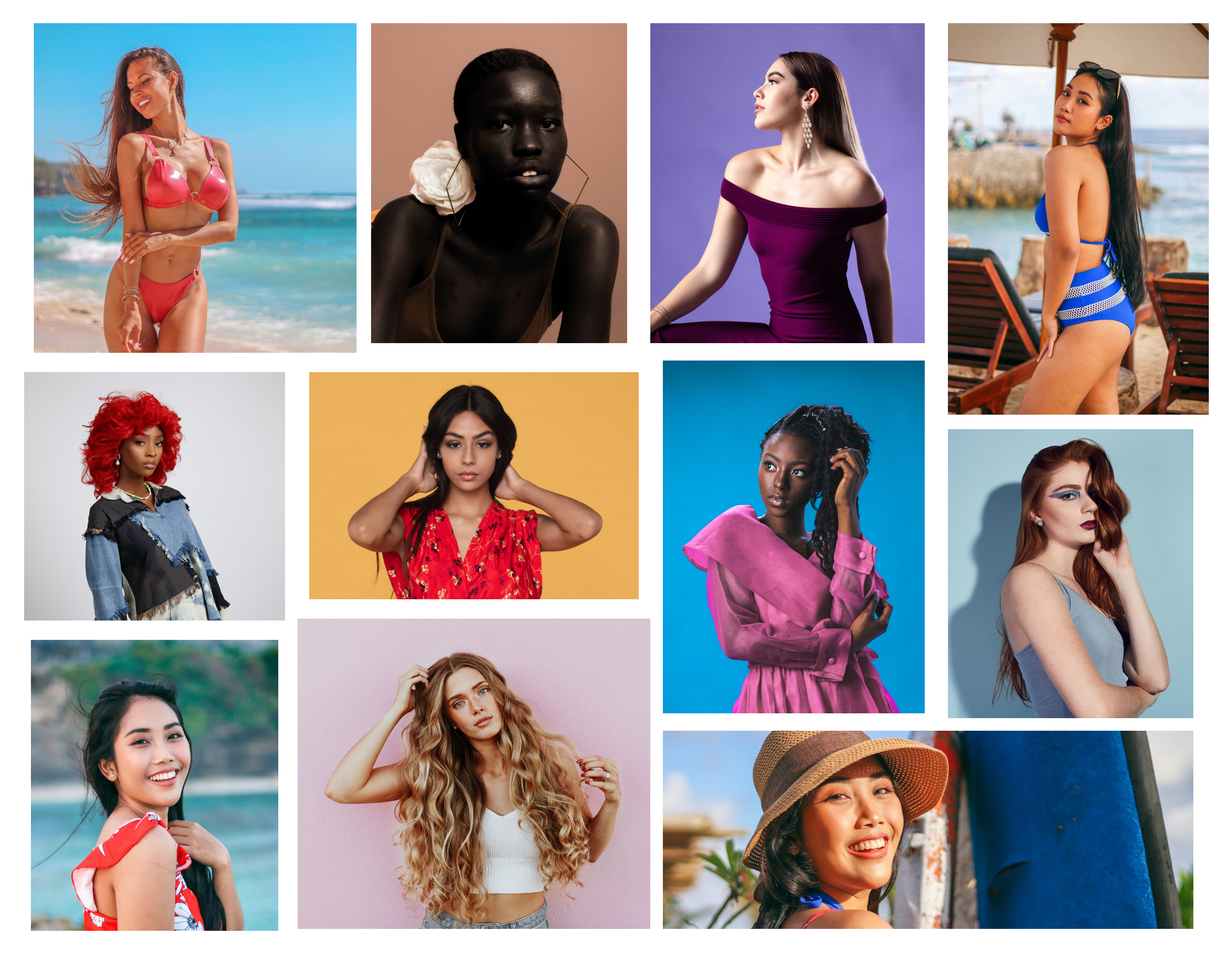
Centering diversity in our visual design solved a user pain point while meeting the goal to drive online sales.
From “Tacky” to Triumph: High-Fidelity Designs
With our visual design goals in mind, I began translating the low-fidelity wireframes into high-fidelity mock-ups. Like a sculptor refining their work, I iterated on high-fidelity designs based on user feedback from our tests.
Three primary questions informed my design strategy:
- How can we ensure ease of navigation throughout the website?
- How can we design in a way that is truly representative of our customer base?
- How can we create a more pleasing and trustworthy user interface?
Mobile Magic Meets Desktop Masterpiece: High-Fidelity Designs
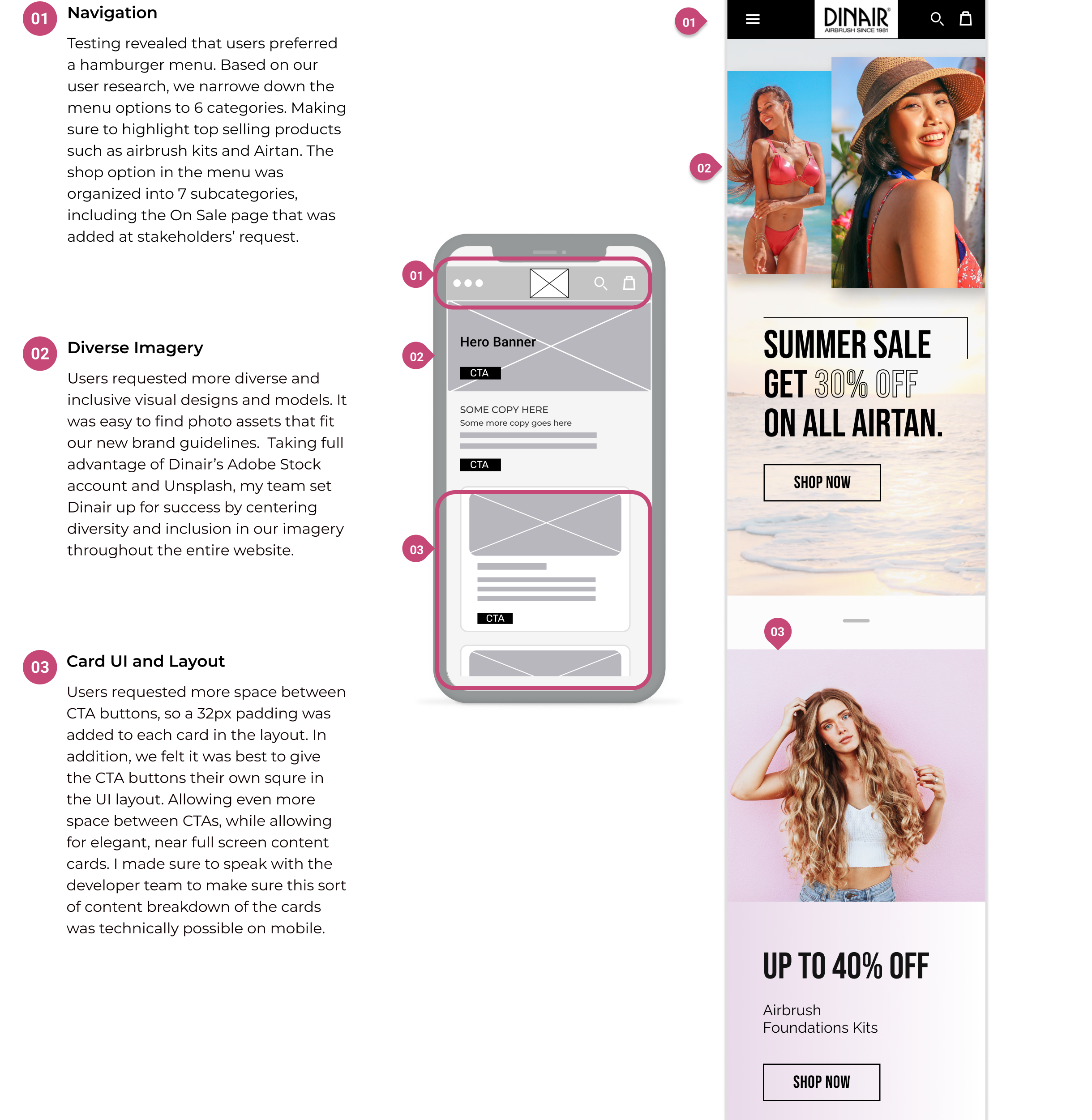
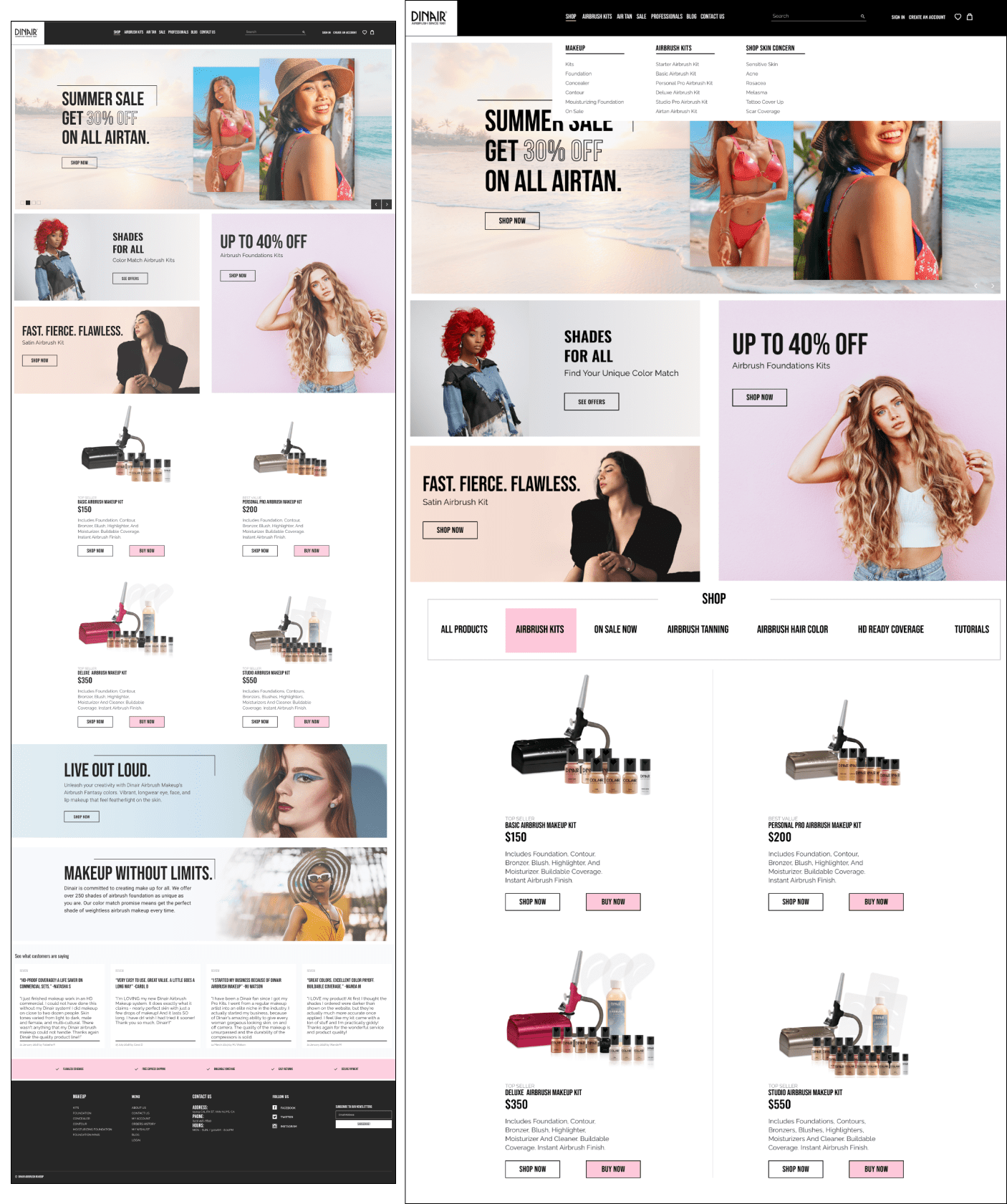
My mobile-first approach paid off beautifully! The streamlined mobile UI designs effortlessly transitioned to desktop, creating a cohesive experience across all screens.
To keep everyone on the same page, I meticulously documented my design decisions. Making collaboration with my team, developers, and stakeholders a breeze.
Meanwhile, my jr. designers created captivating banners and card graphics. Adding pops of color and personality to the website, based on data from our user research and my art direction.
Test for Success: High-Fidelity User Testing
Even as the website neared completion, I insisted user feedback remained our north star. My designers continued to run guerilla user tests while I collaborated with the developer team, and tightened up the high-fidelity designs.
Six new makeup artists, our ultimate judges, put the “Buy Now” flow to the test. Their insights fueled further refinements, solidifying decisions and resolving any lingering stakeholder concerns.
Users Liked
-
The pink Buy Now button.
-
The new diverse and inclusive visual design elements.
-
All users rated navigation as easy to use and intuitive.
-
The product page accordions housing long-form content.
Users Felt
- All users felt confident about navigating the website and completing their task.
- Users felt that the site looked trustworthy and “fashionable”.
- It was somewhat hard to notice what navigation menu option was active.
Users Wished
- For a way to quickly view different product categories on the homepage.
- For a way to shop by skin type and skin/makeup concern.
- There was just one homepage banner instead of a carousel.
Homepage Heroics: Iterating Based on Testing Results
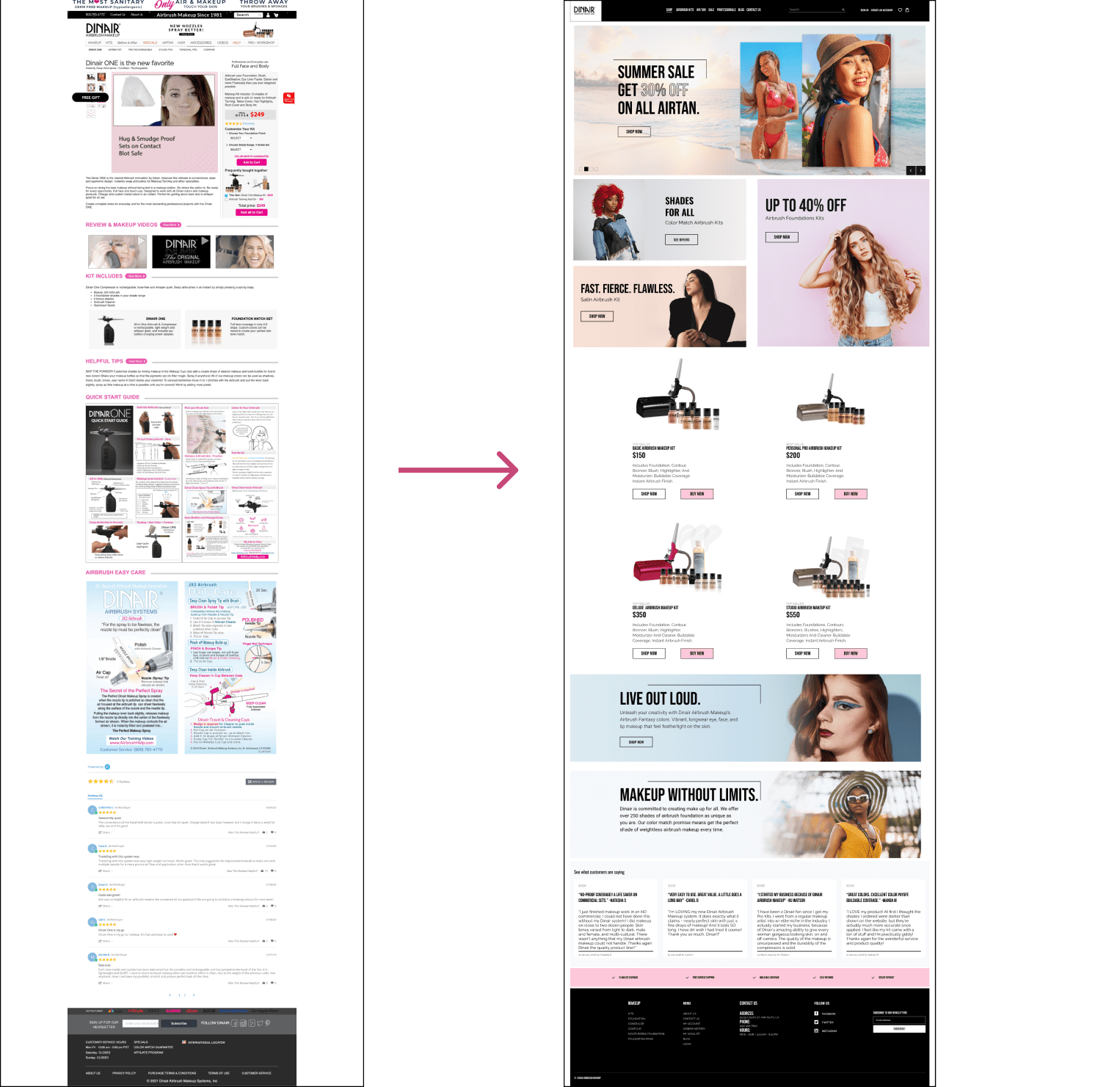
High-fidelity testing unveiled users’ desires for a streamlined homepage. They craved quick category browsing (makeup, airbrush kits, skin concerns, etc), one crisp banner instead of a carousel, and a slimmer desktop navigation menu. We listened!
Here’s how I transformed the homepage:
- Categorical Clarity: Reorganized the “Shop” section into three main categories, making product discovery a breeze.
- Tabbed Tidy-Up: Adding a new tabbed submenu lets users toggle between products effortlessly, keeping things organized and visually pleasing.
- Tutorials & Blog Bonanza: Stakeholders requested dedicated spaces for tutorials and blog content. I found the perfect balance, integrating them into the homepage without sacrificing user experience.
Throughout this process, I kept the developer team in the loop, ensuring technical feasibility for every user-inspired tweak. The result? A homepage that sings in harmony with user needs. 🙌
4) Results & What I Learned
Celebrating Dinair’s Digital Evolution: Presenting to Stakeholders and Results
The high-fidelity designs were well received during our stakeholder presentation! Buoyed by positive feedback, we doubled down on user-centricity. Continuing A/B testing polished the visual designs, to continue to keep iterating and improving the Dinair user experience.
Post initial launch, online sales increased 20%. Our work also resulted in more clicks per view and digital engagement in two months.
This success was no accident. It was the fruit of:
- Normalizing user research: We embedded user insights into every design decision, ensuring every pixel resonated with real-world needs.
- Collaboration at its finest: Internal workshops with developers and marketers kept everyone on the same page, fueling seamless execution.
- Dina’s workshop wonders: Our built-in audience of eager customers at Dina’s in house workshops provided invaluable feedback, shaping the website into a user experience masterpiece.
This UX design victory taught me one key lesson: taking the time to lay a foundation of normalizing user research, and internal workshops with our developer and marketing teams process was so worth it! I learned that insisting on setting up a user research process for my team to drive design decisions was absolutely essential. User research is not just a box to tick, it’s the rocket fuel that propels success.
Embracing Inclusion, Fueling Growth: Diversity is Essential for Both Users and Business
This project really solidified for me just how important diversity and inclusion are.
The rebrand wasn’t just about aesthetics; it was about embracing diversity and inclusion as a powerful business driver. Studies show that companies featuring diverse advertising and content experience a 45% market share growth and are 70% more likely to tap into new markets. It was clear: reflecting the vibrant tapestry of our customers was key to success.
This wasn’t just about checking a box; it was about giving users the representation and connection they craved. And guess what? It worked! By featuring diverse models and showcasing our commitment to inclusivity, we resonated with a wider audience. This wasn’t just about representation; it was about empowering everyone to feel seen and beautiful.
Great UX Design and Leadership Begins with Empathy
Working on this project solidified my belief that empathy isn’t just a UX design principle, it’s the bedrock of good leadership. Guiding my jr. designers was an absolute privilege. I remembered my own early career and relished sharing my knowledge and seeing them blossom.
Every step of the way, I nurtured their confidence. They created fantastic work, and I made sure they knew it! Design thinking and mobile-first were our mantras. Brainstorming sessions and workshops became playgrounds where collaboration and creativity could thrive. I led by example, showing them how to tackle challenges with a playful, inquisitive spirit.
This unlocked their potential, not just as designers, but as problem solvers. They came out of their shells, embracing new ideas and challenges with infectious enthusiasm.
Witnessing their growth was the ultimate reward. This project wasn’t just about creating a website; it was about building a team, and that’s the kind of success that truly leaves its mark.
Check Out More Case Studies
Voting Solutions for All People
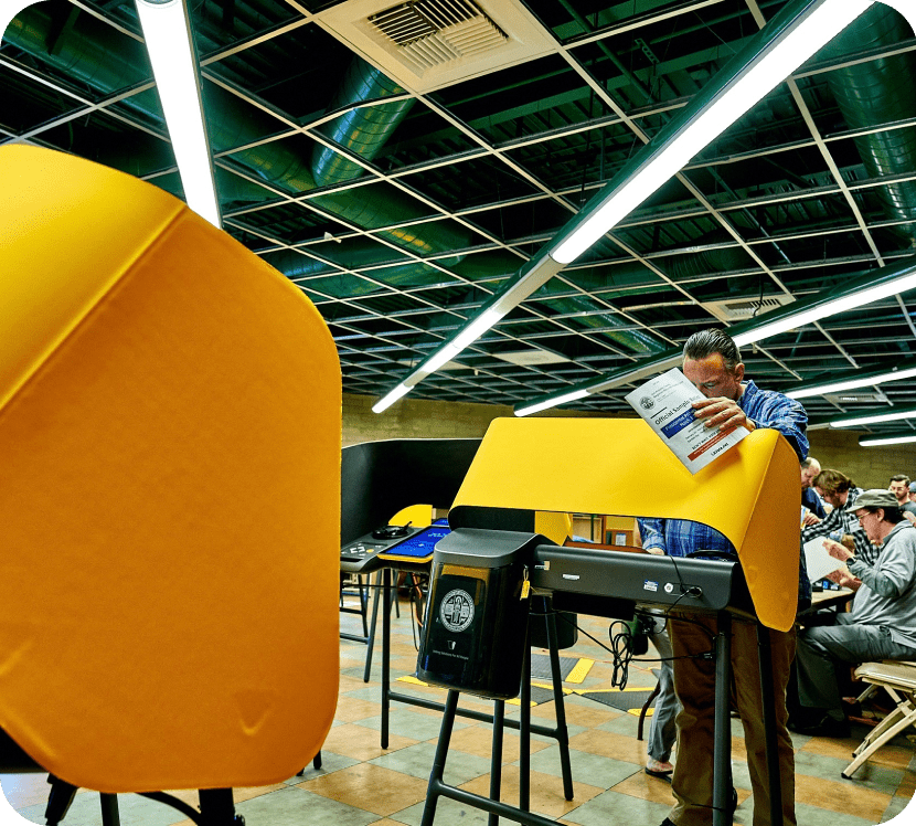
VSAP voting solutions modernized the way LA County votes, making in-person voting accessible to all residents of LA County. Working as part of 6 member team in an agile environment, I conducted lab based user research and user testing on VSAP Ballot Marking Devices. Our work in a 73.8% turnout of registered voters in Los Angeles County on VSAP’s launch election. (Far above the normal LA county average).
MongoDB
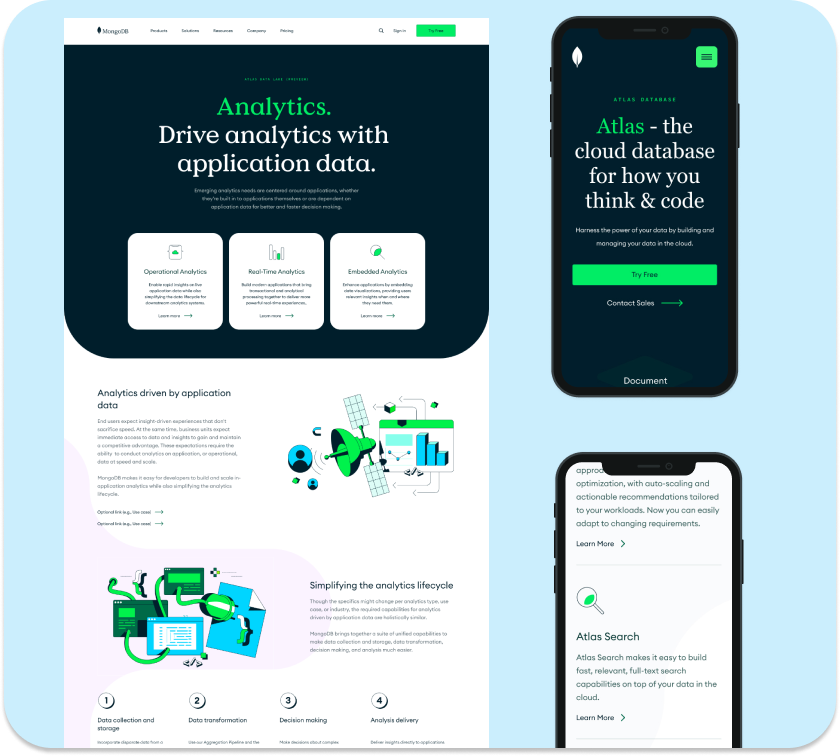
MongoDB is the leading NoSQL database used to build highly scalable Internet and mobile applications. As part of the Web UX team thought deeply about how we interacted with our diverse user base. While internally, increased collaboration with other teams working on the project. Culminating in a 40% increase in our FT/PT CVR conversion rate.
(Password Protected)
